
Design
Selected design work & frames
Hill Vallery Hero - Album Art
Role: Art Direction / Design
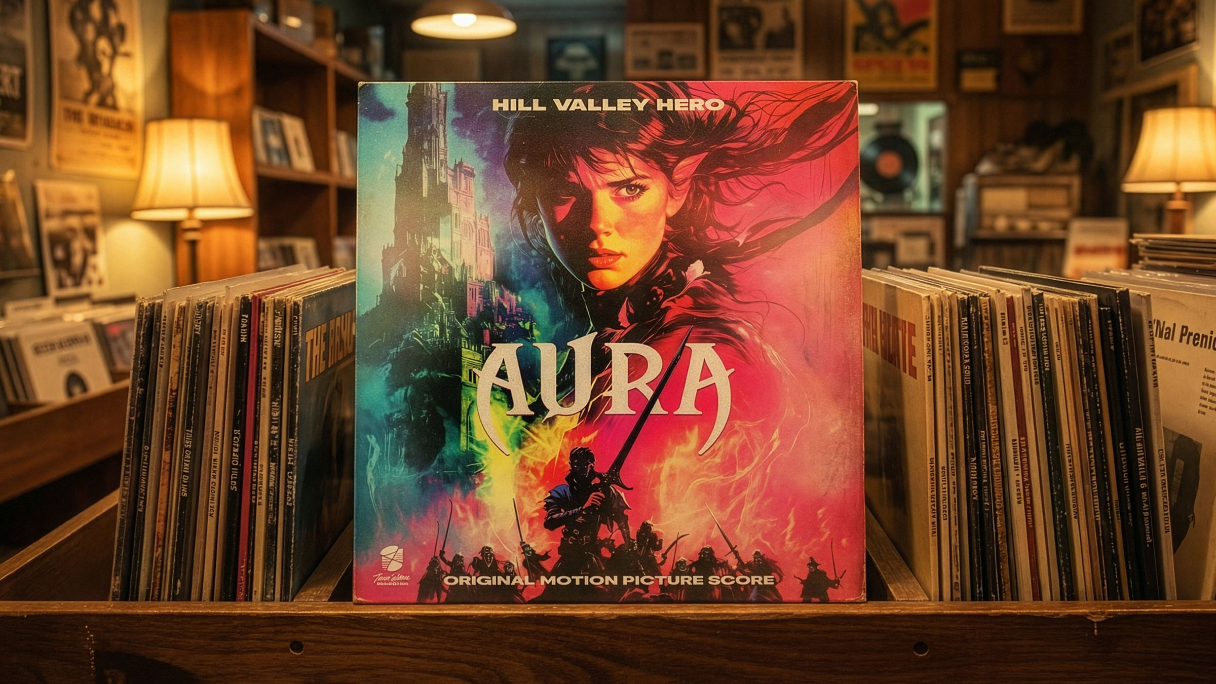
For Hill Valley Hero, I developed a series of album covers that translate his self-described “arcade-fuelled, 80s-inspired retro synths” into bold, cinematic visual identities. The design direction pulls from classic 80s movie posters, arcade cabinets, vintage game packaging and neon-soaked sci-fi aesthetics.
We focused on high-contrast colour schemes, dramatic lighting, and typography reminiscent of VHS-era title cards to create covers that feel both nostalgic and contemporary. Each piece balances retro references with modern composition and polish, ensuring the artwork resonates across streaming platforms while maintaining the raw, electric spirit of synthwave culture.
Ivy Leaf - Branding
Role: Product Design / Brand
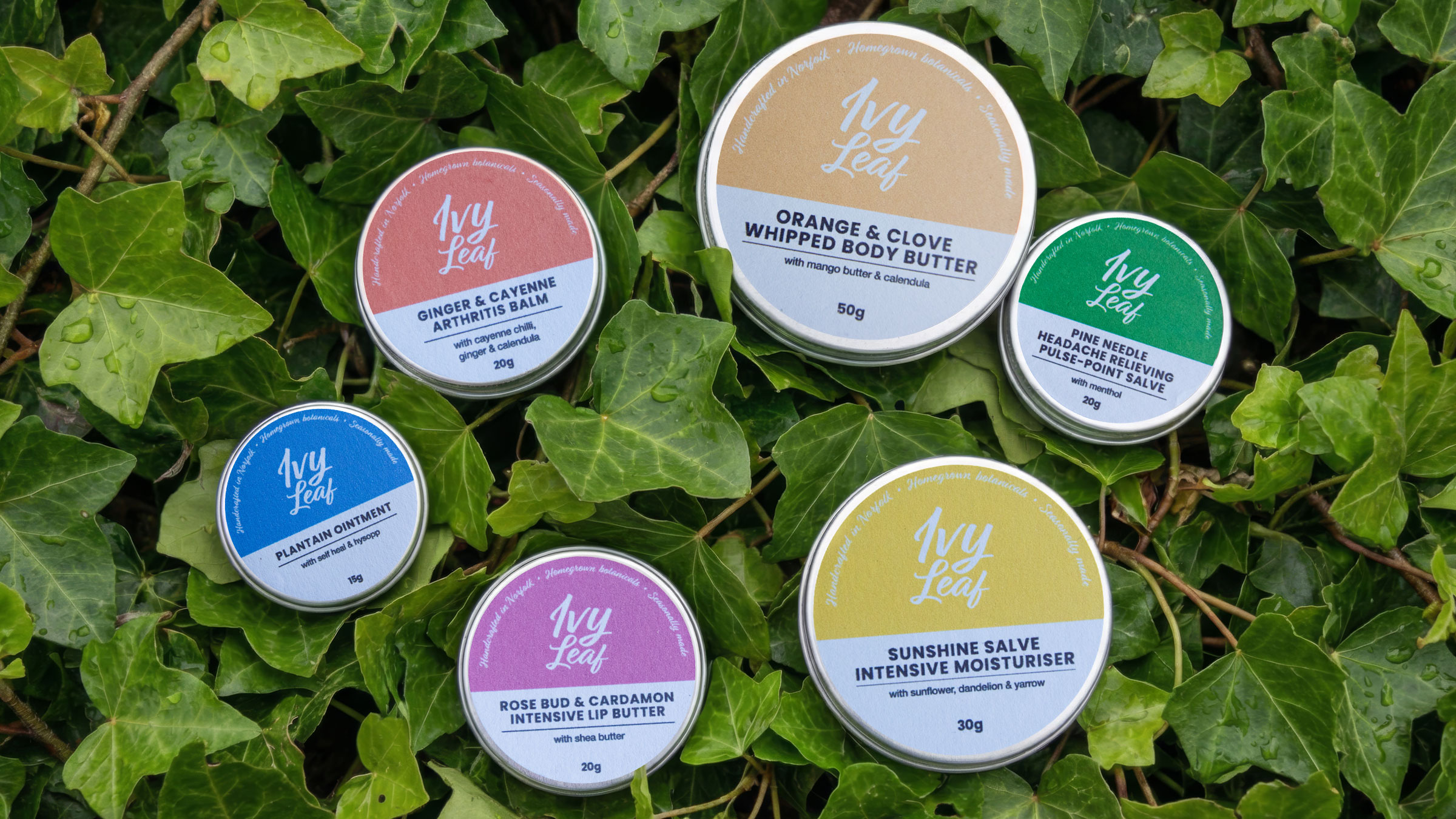
In designing the look and feel for Ivy Leaf, I wanted the visual identity to feel as considered and grounded as the skincare itself. Inspired by Norfolk’s open landscapes and the ritual of growing and harvesting by hand, I created a brand that balances softness with structure. The handwritten logotype brings a personal, homegrown warmth, while clean, understated typography keeps the overall aesthetic calm and contemporary. The circular layout of the labels subtly echoes traditional apothecary tins, reinforcing the idea of slow craft and small-batch care.
Colour plays a key role in expressing seasonality and botanical character. Each product is assigned a nature-led palette drawn from its key ingredients — warming spice tones, fresh greens, soft florals and sunlit yellows — creating distinction while maintaining a cohesive system. The result is packaging that feels tactile, honest and rooted in place: modern in its simplicity, yet deeply connected to the land, the process and the hands that make it.
Bloody Cuts - Sapling Promotional Posters
Role: Art Director / Designer
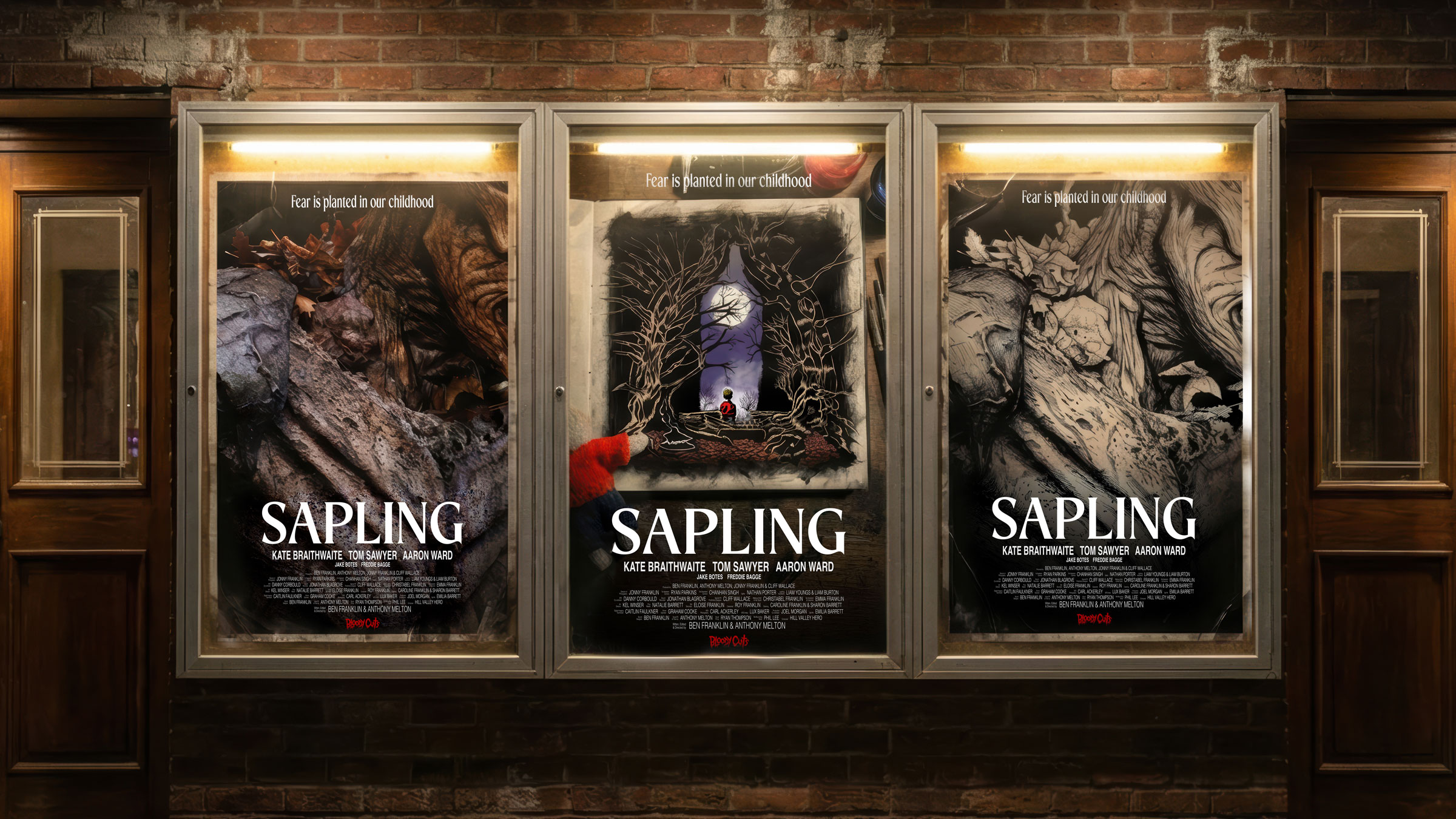
For this campaign, I designed the poster layouts and worked closely with the original source imagery: haunting photography by Carl Ackerley and intricate illustration by Kel Winser. The three final artworks draw on organic textures, folklore-inflected imagery, and storybook unease — reflecting the film’s themes of memory, myth, and something growing in the dark.
Sapling is the newest short from Bloody Cuts — a dark, atmospheric descent into the roots of childhood terror. Co-directed by Anthony Melton & Ben Franklin, the film explores how the fears we inherit and imagine take hold long before we understand them.
From sculptural woodland forms to inked, fairytale-inspired compositions, each piece hints at the same unsettling truth:
Some fears don’t fade. They take root. Sapling coming soon.
The Dreaming Void - Branding and Album Art
Role: Art director and designer
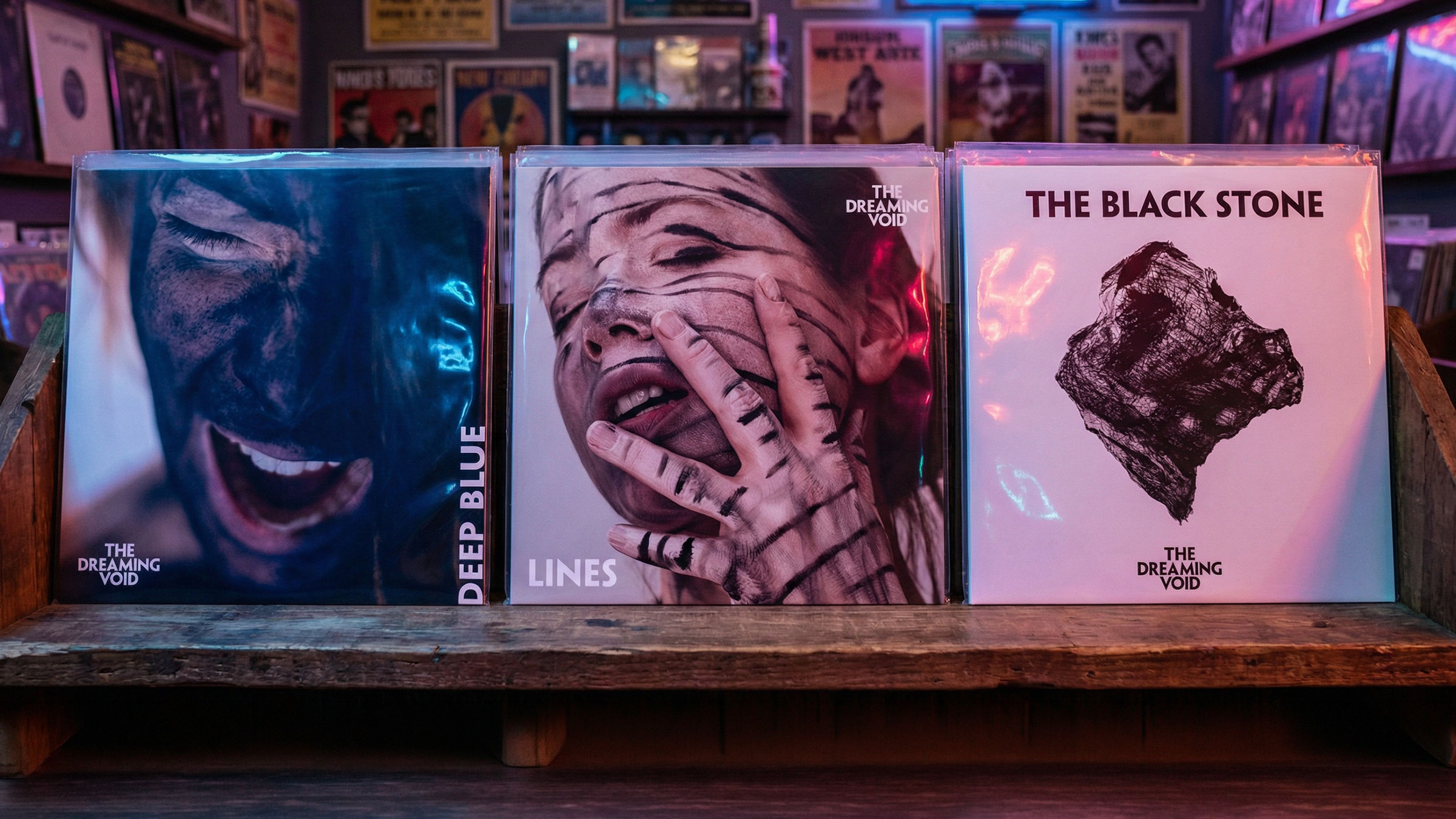
The Dreaming Void sit at the collision point between early ’80s alternative rock and modern post-wave synth culture — channeling the emotional charge of Future Islands, the brooding romanticism of Echo & The Bunnymen, and the sharp-edged cool of The Cure, The Pretenders, and Curve. Vocally, their energy pulls from icons like Chrissie Hynde, Blondie, and Gwen Stefani — strong, expressive, and unafraid of texture.
The visual identity needed to live in that same tension: nostalgic but not retro, raw but controlled, intimate yet stylised.
I developed the album photography and overall branding direction to reflect that duality. The imagery leans into stark light, tactile texture, and bold graphic interventions — black pigment, hand-drawn lines, and physical mark-making directly on skin. The result feels immediate and visceral, as though emotion is breaking through the surface.
Vocalist Amy Hart both modelled in the campaign and contributed illustrated elements, bringing an authentic, handcrafted layer to the work. The interplay between photography and illustration mirrors the band’s sound — organic instrumentation intersecting with synth-driven atmosphere.
Typography was kept confident and minimal, allowing the imagery to breathe while reinforcing a contemporary alt aesthetic. The branding system is adaptable across singles, digital platforms, and live assets, ensuring visual cohesion as the project evolves.